Interfaces that are simple, usable, and look great.
We design wireframes, prototypes, and design systems that keep complex ideas simple. Because a good-looking app that nobody can figure out how to use is just bad design.
What we design
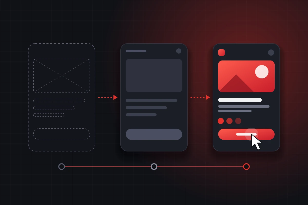
From early-stage wireframes to complete design systems.
Wireframes
The skeleton of your product. We map out the structure before adding visual polish.
- Low-fidelity structure
- User flow mapping
- Fast iteration before design
Interactive Prototypes
Click through the app before code is written. Test the experience with real users.
- Clickable Figma prototypes
- Realistic transitions
- Usability feedback ready
UI Design
The visual layer. Beautiful, consistent interfaces that match your brand guidelines.
- Desktop & mobile screens
- Colours, typography, spacing
- Dark mode variants
Design Systems
A reusable library of components so your team can build new pages quickly.
- Reusable components & variants
- Design tokens (styles)
- Easy handoff to developers
UX Audits
Already have an app or website? We review it and tell you exactly where users get stuck.
- Heuristic evaluation
- Navigation & flow review
- Accessibility checks
Design Handoff
We don't just dump a Figma file. We work with your developers to ensure smooth implementation.
- Developer-ready specs
- Asset exports
- Post-handoff support
What's included in every project
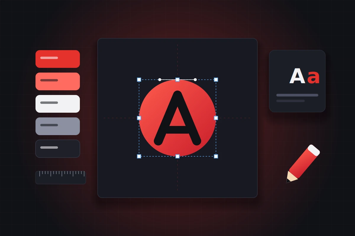
We don't just draw screens. We create a complete, usable system that your developers can actually build.
-
Clean Figma Files Organised layers, auto-layout, and named components.
-
Responsive Design Layouts designed for mobile, tablet, and desktop screens.
-
Accessibility Basics Colour contrast and font sizes that are readable for everyone.
-
Developer Handoff CSS values, spacing scales, and interactive states documented.
-
Revisions Included We iterate until the user experience feels exactly right.
Tools we use
Industry-standard tools for collaboration and prototyping.
 Figma
 Adobe XD
 Sketch
 Photoshop
 Illustrator
 Zeplin
 Miro (Flows)
 Notion
How we deliver your design
A clear five-step process from research to developer handoff.
Research
Understand your users, goals and competitors.
Wireframes
Map out the structure and user flows.
Visual UI
Apply brand styles, colours and typography.
Prototype
Build a clickable version to test the flow.
Handoff
Deliver developer-ready files and documentation.
Design packages
Three starting points. Every package is customised to your scope after a short discovery call.
Wireframe
Best for validating the structure before spending on visual design.
- Up to 5 key screens
- Basic user flow mapping
- Low-fidelity structure
- 1–2 week delivery
UI Design
For products that need a complete, beautiful visual interface.
- Up to 10–12 screens
- Full visual UI (mobile & desktop)
- Clickable Figma prototype
- Developer handoff
- 2–3 week delivery
Design System
For growing teams that need a reusable, scalable design library.
- Complete component library
- Auto-layout & variants
- Design tokens & styles
- Full documentation
- 3–4 week delivery
UI/UX design FAQ
Quick answers before you get in touch.
What is the difference between UI and UX?
UX (User Experience) is about how a product works and flows — the logic and structure. UI (User Interface) is about how it looks — the visual design, colours, and typography.
Do you provide clickable prototypes?
Yes. We build interactive prototypes in Figma so you can test the flow and feel of the app before a single line of code is written.
Do you hand over the design files?
Absolutely. We hand over fully organised Figma files with components, styles, and developer-ready specs.
Can you redesign an existing app?
Yes. We start with a UX audit to find where users are struggling, and then provide a modernised, cleaner interface design.